
Guest blog post by Sangita Kulathinal and Antti Tuomi-Nikula, THL
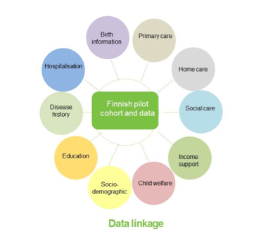
Finland provides pilot data from a cohort study under which a group of subjects are followed up for a specific disease endpoint. Background data for the cohort are also extracted (Data linkage figure). In order to create the pilot data, several registers are being linked and then the data are processed. More details on the methodology of data integration can be found from Data Integration Methodology.
Linking data from several registers also raises a question of secondary use of data. Under data regulation and permission, the integrated data are created. More details on regulation etc. can be found from Secondary use of health and social services data taking off.
Let us now think of urns which contain balls of different colours. These urns (marked 1, 2, 3, and so on) can be taken as subjects and colours characteristics/feature of a subject. As long as, all balls are held together in an urn, it is hard to distinguish different colours and hence, all urns appear similar. Now, an observer decides to separate all urns (without looking at the original marking on the urn) which have a yellow coloured ball (say, grouping according to gender). Further, she separates urns which have a blue coloured ball in addition to the yellow coloured ball (say, certain disease diagnosis). And she continues to group the urns according to colours of balls. She is finally left with a small number of urns (say, 2-5) which meet with certain colour combination of balls. She is clever enough to guess the original marking of the urn.
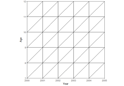
In the pilot data, cohort members are followed for a certain disease. If the disease occurs then the date of diagnosis is extracted from the register. In addition, any disease history and socio-demographic information etc. are extracted from different sources. Such data can be typically analysed using Lexis diagram. A subject, who is 7 years old in 2000, moves by one year in age and calendar year direction simultaneously. For example, he/she is 8 years old in 2001, 9 years old in 2002 and so on. Each line in Lexis diagram represents such movement.
The information from such data are summarised in Lexis diagram by calculating the number of diseased subjects and the total time spent in each square (age x year). This information is further split according to additional information such as gender, education, disease history. These resemble the colours of balls in an urn.
Anonymization of the above-described data is similar to separating urns according to colours of the balls in such a way that the original marking of the urn cannot be guessed. In this example, an urn corresponds to a subject’s time spent in each square so the same subject is typically represented by several urns. To some extent this offers a flexibility to use the data for statistical analysis without identifying subjects. When more and more characteristics are added and data are separated, the chances of identifying subjects increase. This is essentially why the clever observer was able to guess the original mark when more colours were added to an urn.